
Luxury Bathroom Renovation Ideas for Gold Coast Homes
A Gold Coast bathroom can’t just look expensive. It has to survive salt air, steamy showers, sandy feet, and the sort of humidity that makes cheap finishes quietly fall apart.
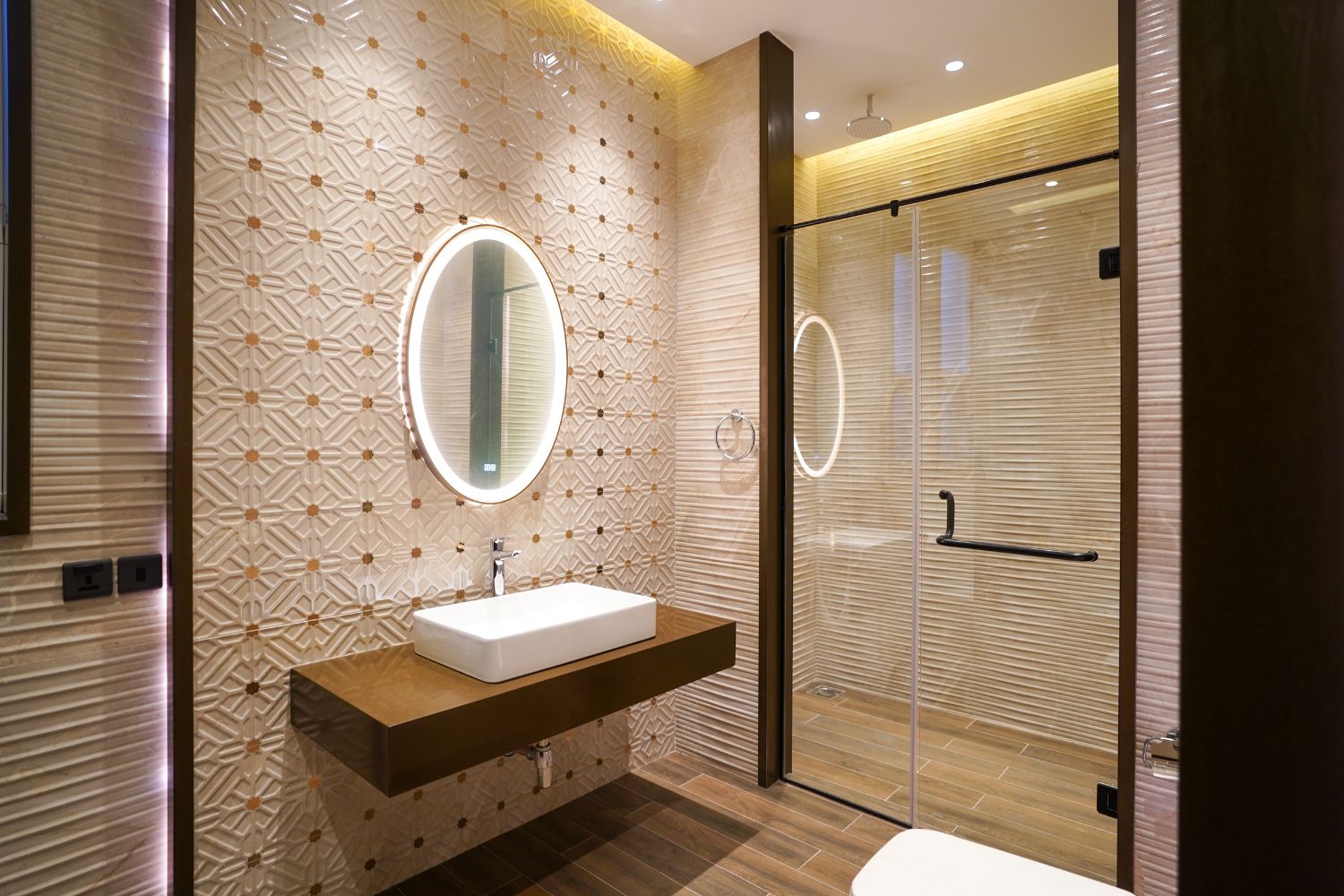
So the goal is simple (and annoyingly hard): calm, coastal elegance… built like it expects a beating.
The Gold Coast palette: quiet neutrals, not beach-themed clichés
You don’t need shells on the wall. You need restraint.
The best Gold Coast bathrooms lean on sun-washed neutrals, ivory, pale taupe, warm sand, then use coastal colour the way a good chef uses acid: sparingly, on purpose. A whisper of seafoam in a niche. A smoky blue towel stack. Driftwood-toned timber.
And here’s the thing: undertones will make or break you. Put a cool grey tile next to a warm cream paint and suddenly the whole room looks… slightly off, like a suit that almost fits.
If you’re exploring luxury bathroom renovations Gold Coast homeowners know this tension well—getting the undertones right is half the battle.
Lighting also changes the “read” of your palette throughout the day. Morning sun can make whites feel crisp; late afternoon can swing them creamy. That’s not poetic, it’s physics.
A small data point that matters: the Gold Coast averages ~69% relative humidity annually (Bureau of Meteorology climate statistics). Design like that number is watching every material decision you make.
Brass in a coastal bathroom? Yes. Cheap brass? Absolutely not.
I’m going to be blunt: coastal homes punish bargain hardware.
In high-humidity, near-ocean conditions, you want finishes and fixings that are actually rated for moisture and corrosion resistance, not “looks similar” in a showroom. In my experience, the failures start quietly: pitting on tapware, swollen cabinetry edges, mirror desilvering, and those little rust freckles around fasteners that ruin the whole mood.
A few picks that tend to behave themselves on the Gold Coast (when properly installed and maintained):
– PVD-coated tapware (harder wearing than many plated alternatives)
– 316 stainless steel for exposed fixings in truly salty zones
– Brushed nickel and matte finishes (they hide water spotting better than high-polish)
– Ceramic composites / solid-surface basins for easy cleaning and fewer stain dramas
Now, this won’t apply to everyone, but if you’re right on the water or you leave windows open most days, treat “humidity resistant finish” like a minimum requirement, not a bonus feature.
One-line truth:
Good ventilation is cheaper than replacing swollen joinery.
The freestanding bath: star of the room, or don’t bother
Freestanding tubs work when you let them win.
If the bath is squeezed between visual clutter, busy tiles, bulky vanities, overdesigned tapware, it stops feeling sculptural and starts feeling like an afterthought that cost a lot. Give it breathing room. Give it clean sightlines. Give it lighting that shapes the curves instead of flattening them.
Placement (the way I’d do it)
Put it where it has a “moment.” Near a window if privacy allows. Opposite the door if you want drama. Not jammed hard against a wall unless the model is designed for that (many aren’t, despite what people try).
Then keep the supporting cast quiet:
– one statement tap (floor-mounted or wall-mounted, but not fussy)
– a small side table or ledge for function
– texture around it, not noise, stone, timber grain, soft matte finishes
Also, tiny detail, make sure your floor can take the load. A filled bath plus a person is not lightweight.
Glass showers: the easiest way to make a bathroom feel bigger
Frameless glass is basically a cheat code for space.
It keeps the sightlines open, lets light travel, and makes even modest bathrooms feel intentional. The trick is to avoid turning it into a maintenance nightmare. If you hate squeegeeing, choose hardware and layouts that reduce splash zones and overspray.
A few practical calls:
– Minimal hardware looks better and collects less grime
– Door swing matters more than people think, out-swing can feel luxe, but only if you’ve got clearance
– Seals and falls have to be done properly or you’ll be chasing leaks forever (ask me how I know)
Tile inside the shower shouldn’t scream for attention. If everything is competing, nothing is luxurious.
Storage in small bathrooms (because benchtops aren’t storage)
If your vanity top becomes a parking lot for products, the room feels messy even when it’s clean.
Go vertical. Steal space from walls. Hide the ugly stuff. This is where a designer’s “pretty” instincts need to get along with a builder’s “real life” logic.
A few solutions that actually earn their keep:
– Recessed shower niches (planned early so they don’t clash with studs and plumbing)
– Floating vanities with deep drawers, not cupboards (drawers are just more usable)
– Slim towers for towels and backup supplies
– Mirror cabinets that don’t protrude like a medicine chest from 1998
Look, open shelving can work… but only if you’re the kind of person who folds towels like a hotel. Be honest with yourself.
Materials that read “luxury” (and still behave in humidity)
Luxury isn’t a single material. It’s a set of contrasts that feel controlled.
Marble: stunning, high maintenance, still worth it (sometimes)
Marble has that depth, veining, translucency, the way it catches light, that engineered lookalikes struggle to replicate. But it can etch, it can stain, and it will humble you if you treat it like porcelain.
If you go marble:
– seal it properly
– wipe spills quickly (yes, even water can leave marks in the wrong conditions)
– use it where it won’t get abused if you’re not into maintenance
For a “best of both worlds” approach, I often prefer marble on feature walls or vanity tops, paired with tougher flooring.
Oak + terrazzo: warm meets crisp
Oak brings warmth and human texture; terrazzo brings sparkle and structure. Together, they feel contemporary without chasing trends.
Keep tones tight: creams, caramel timber notes, soft greys. Overdo colour and you lose the calm.
Metallic accents: pick a lane
Champagne bronze and brushed brass can be gorgeous here, coastal warmth, subtle glamour. Chrome can feel sharper and more “spa,” especially against cool stone. Matte black looks great in photos but shows mineral spotting like it’s its hobby.
My opinion: metals should support the room, not headline it. If you notice the tapware before the space, something’s off.
Budget + timeline (the part people try to skip)
Renovations don’t go wrong because someone chose the “wrong tile.” They go wrong because the plan was fuzzy and the sequencing was sloppy.
Build your budget around the boring-but-expensive categories:
plumbing, waterproofing, electrical, cabinetry, tiles, screens, fixtures. Then add a 10, 15% contingency because Gold Coast renos love surprises, wall framing that isn’t square, hidden water damage, delivery delays, the whole circus.
A clean project rhythm usually looks like:
– demolition + rough-ins
– waterproofing + tiling (don’t rush this, ever)
– cabinetry + fit-off
– final detailing: mirrors, lighting, accessories
If a contractor promises a lightning-fast schedule while glossing over drying/curing times, that’s not efficiency. That’s risk.
The real “luxury” move on the Gold Coast
Choose fewer things. Choose better versions of them.
A calm neutral base, a tub that feels like sculpture, glass that disappears, materials with honest texture, fixtures that won’t corrode the moment summer hits, and storage that keeps daily clutter out of sight, that’s the formula I’ve seen hold up, year after year, in coastal homes.

Search for the best Chain Link Fence
Winter Warmth, Summer Cool – Seasonal Comfort through Advanced Wall Insulation